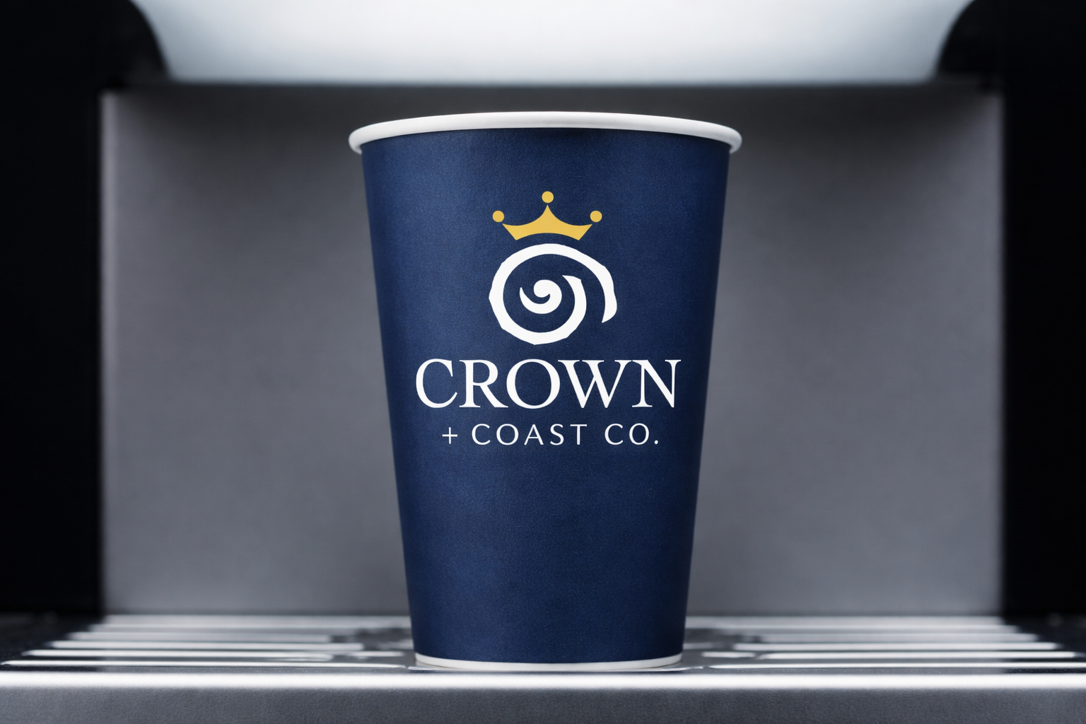


Crown + Coast Co. is a brand identity developed for a freelance client, inspired by the dual identity of North and South Carolina. The goal was to create a premium, coastal-driven brand that reflects both regions while elevating the product's perception through a refined, high-end visual language.

The project began with an extensive initial exploratory sketching phase, where I explored multiple visual directions combining coastal elements with symbolic forms of value and quality.
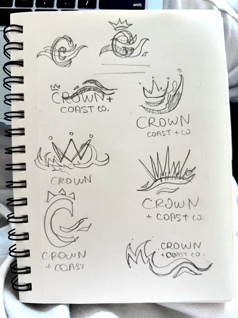
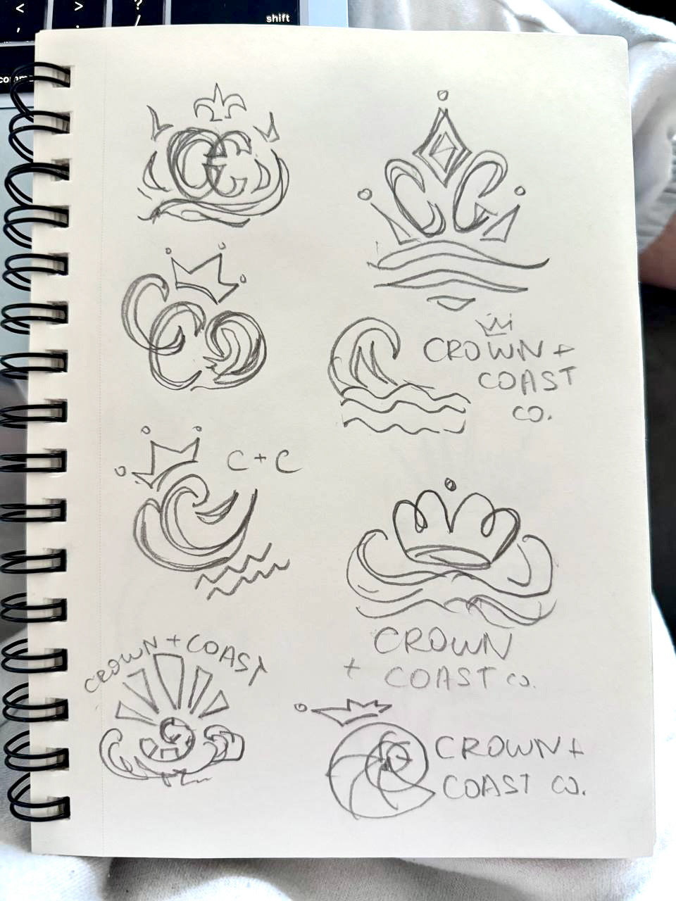
I developed four primary concepts: (1) a shell-based crown motif, (2) a wave-integrated monogram, (3) a geometric coastal emblem, and (4) a minimal crest system. Each concept approached the balance between place and perception differently, allowing for strategic evaluation of clarity, scalability, and brand tone.
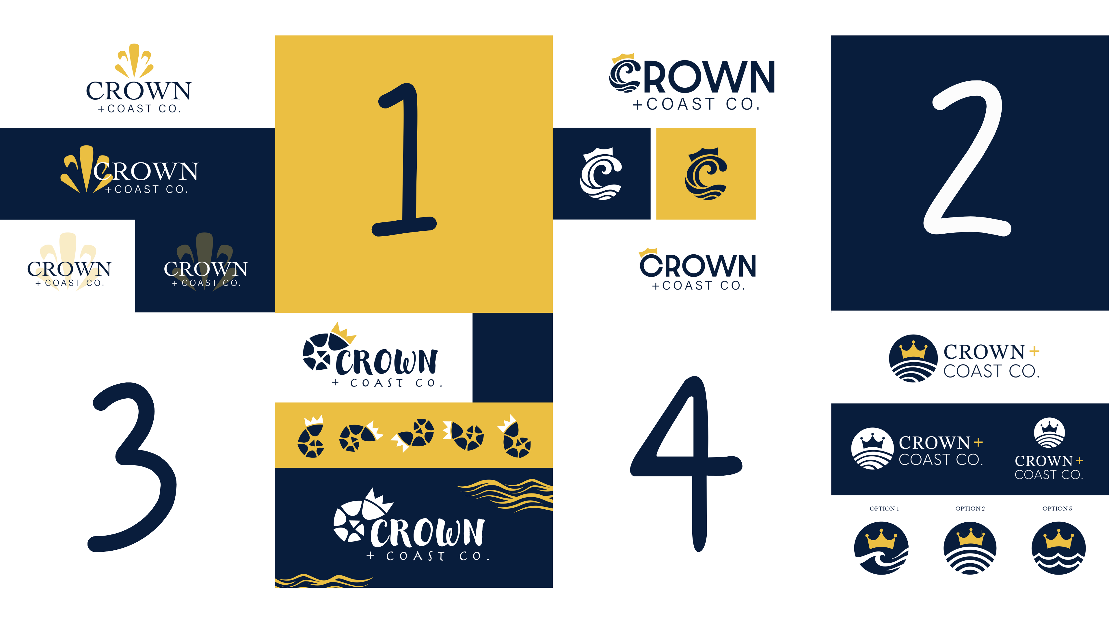
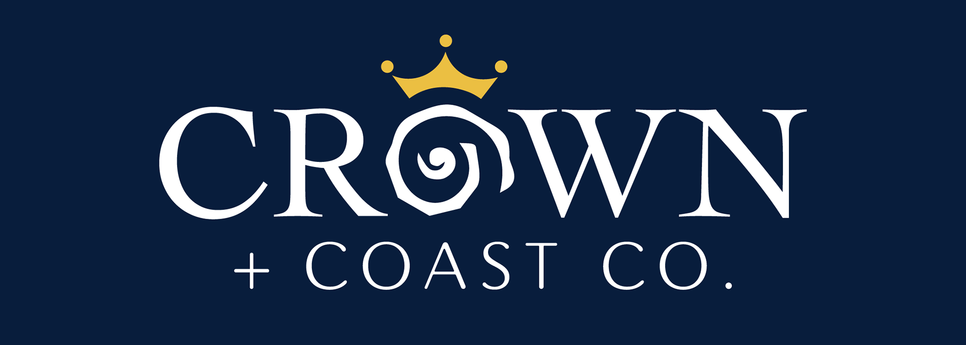
Through iteration and client feedback, I selected and refined the direction that merged a crown with a spiral shell form, creating a mark that feels both elegant and regionally grounded. This final direction best balanced recognizability, scalability, and brand distinction.
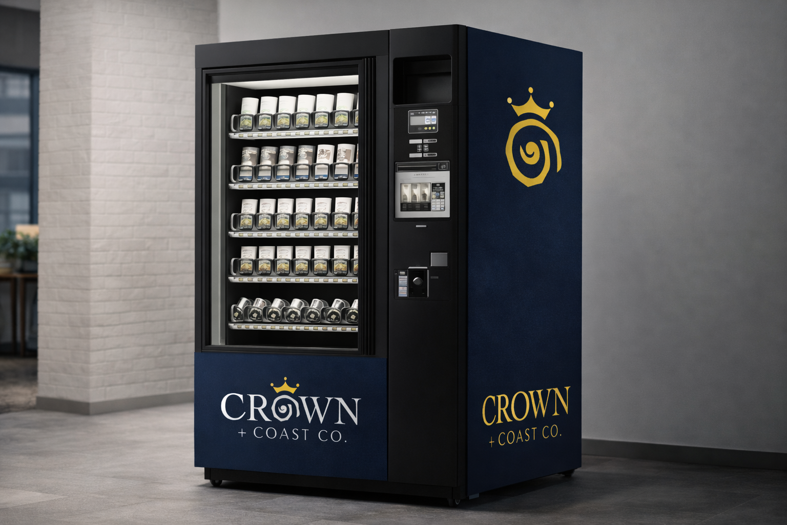
The identity was applied to vending machine design, where it needed to be clear, visible, and effective at a large scale. I adapted the logo for strong contrast and easy readability, using simple layouts and clear placement to ensure it stands out and is instantly recognizable in a high-traffic environment.