

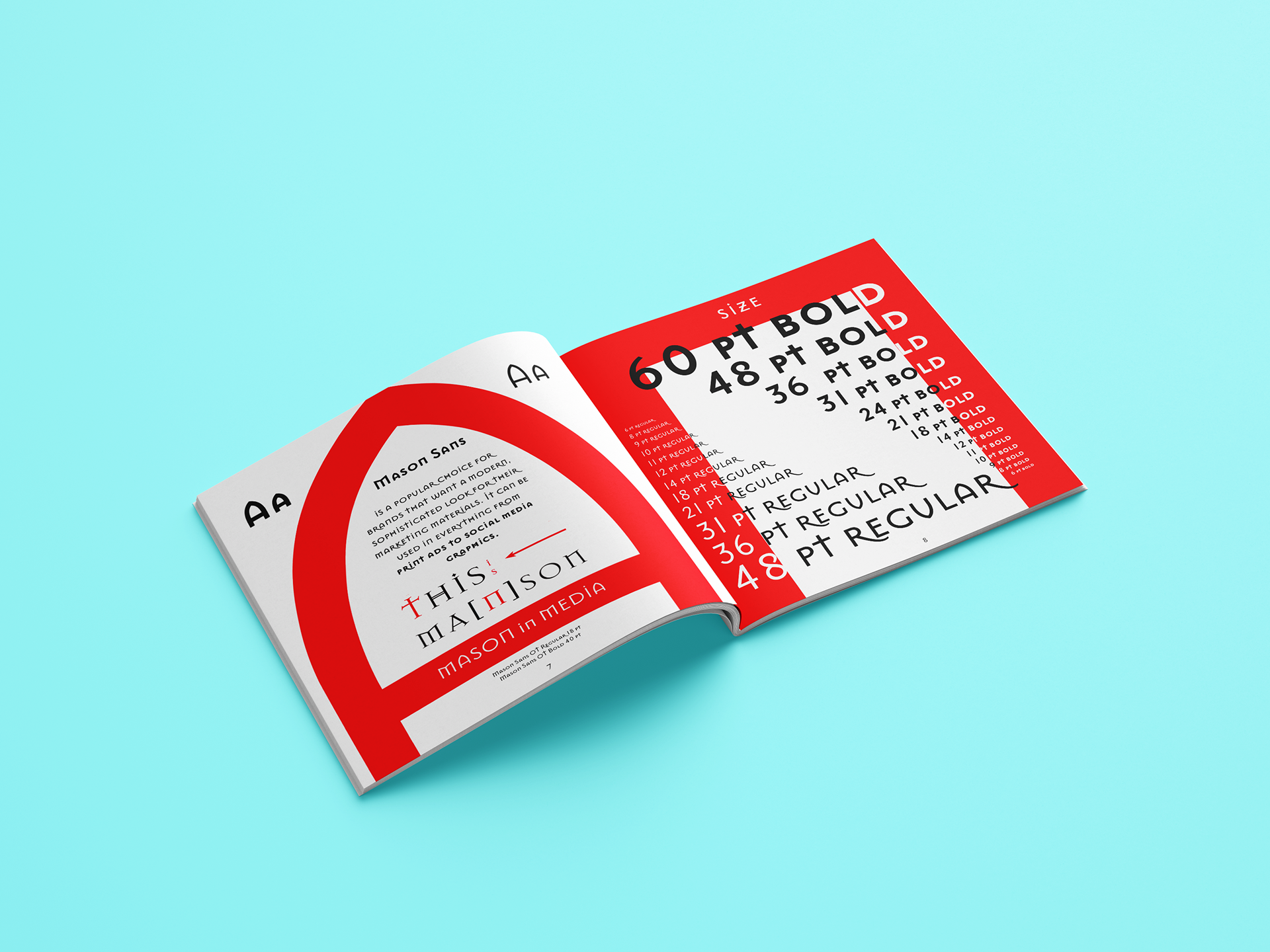
Developed for a Northbound Press publisher. This 20-page, 5 × 5-inch type specimen book presents the Mason Sans typeface through a structured editorial system. The direction focuses on clarity, hierarchy, and controlled use of form to reflect the typeface’s versatility across text and display.
A restrained red, black, and white palette and geometric compositions were used to reinforce consistency and create a strong visual rhythm across spreads. The square format supports a modular layout, allowing type to scale and interact across pages while maintaining legibility.
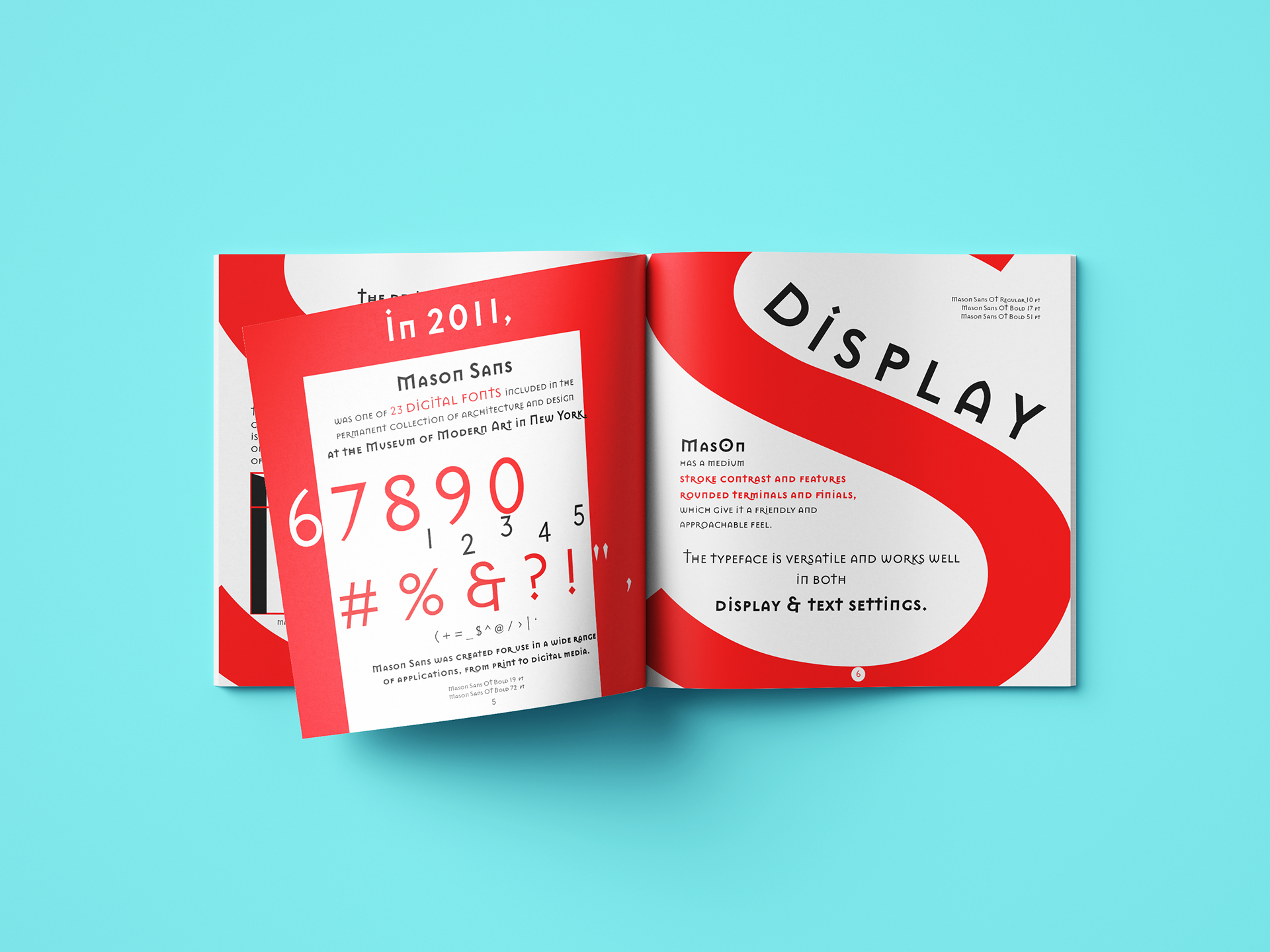
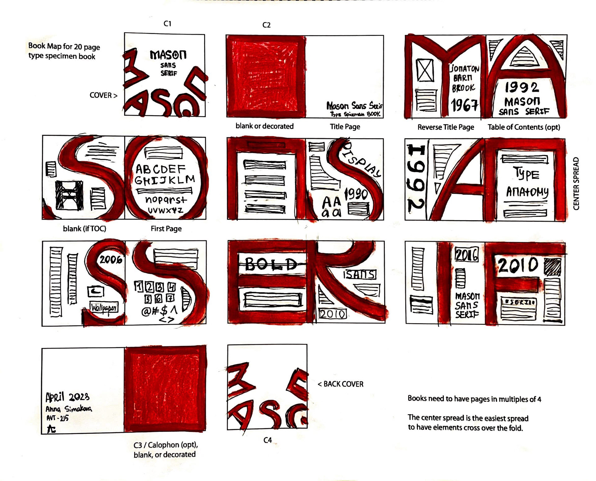
The project emphasizes both the functional qualities of Mason Sans and its potential as a visual element within contemporary editorial and branding contexts.